Computational Chemistry Consortium
Website
The Computational Chemistry Consortium is a dedicated group of partners leading the advancement of combustion and emissions modeling. Spearheaded by Kelly Senecal (of Convergent Science) and Henry Curran, the C3 website needed an update. The website is small and did not need a huge overall.
I reviewed the current website and how the pages are laid out. Rather than having multiple pages with little information on them, I was able to organize and combine certain pages.
Employer: Convergent Science
Role: Web Designer
Tools used: Figma, Photoshop
Collaborators
Marketing Team: Collaborated with design team lead reviewing designs before presenting to Kelly, and accessing copy from marketing copywriter.
Development: Worked with lead developer providing access to my figma file so we could collaborate within figma.
Improvements
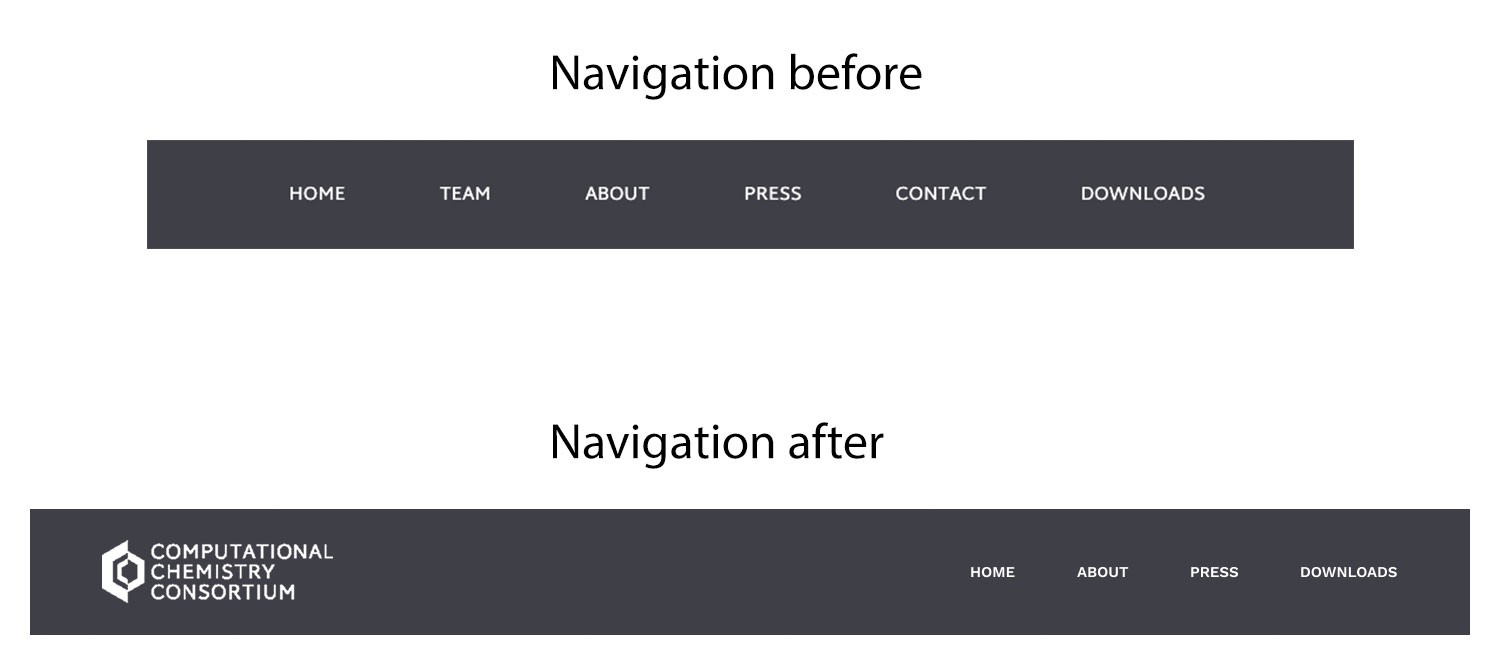
One of the things I wanted to update was the navigation. The changes are small but the previous navigation did not have the logo in the upper left and had more menu items. By combining the team info into the about page, this gave users less items to click. Placing the contact email on the homepage replaced having a dedicated contact page with so little information.

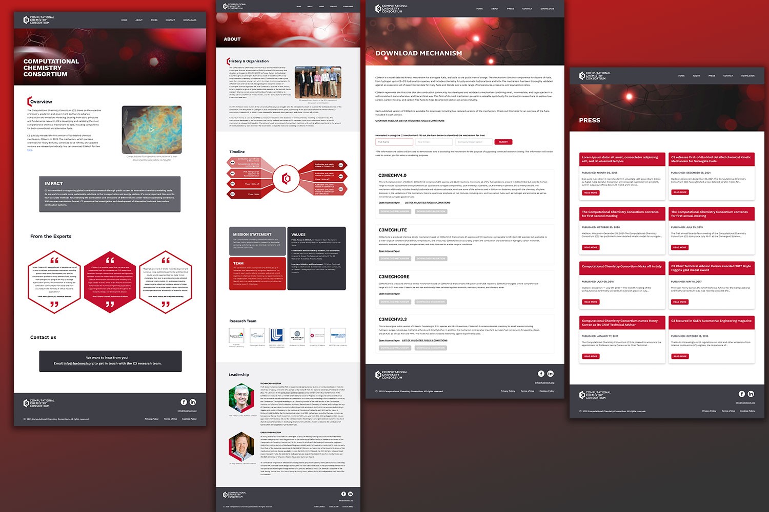
I also wanted to add some more visual interest to the site adding hero images to each page. Since there was very little information and no images from the Consortium, I created these cohesive hero images with direction from my team lead.
Redesign
The redesign had a few goals: better organization, more visual interest and less clicks.
By organizing the content and combing pages - it solves the less clicks goal. Adding the team information and leadership to the about page helped reduce the navigation menu items.
Adding a video to the introduction, cohesive hero images, visual pleasing timeline graphic and nods to the C3 logo shape throughout provides visual interest.
Visit the live site here.
Styles and Components
I created a component for the press card and buttons. Provided a value scale of the branding colors so I could play with different shades but still stay in brand.
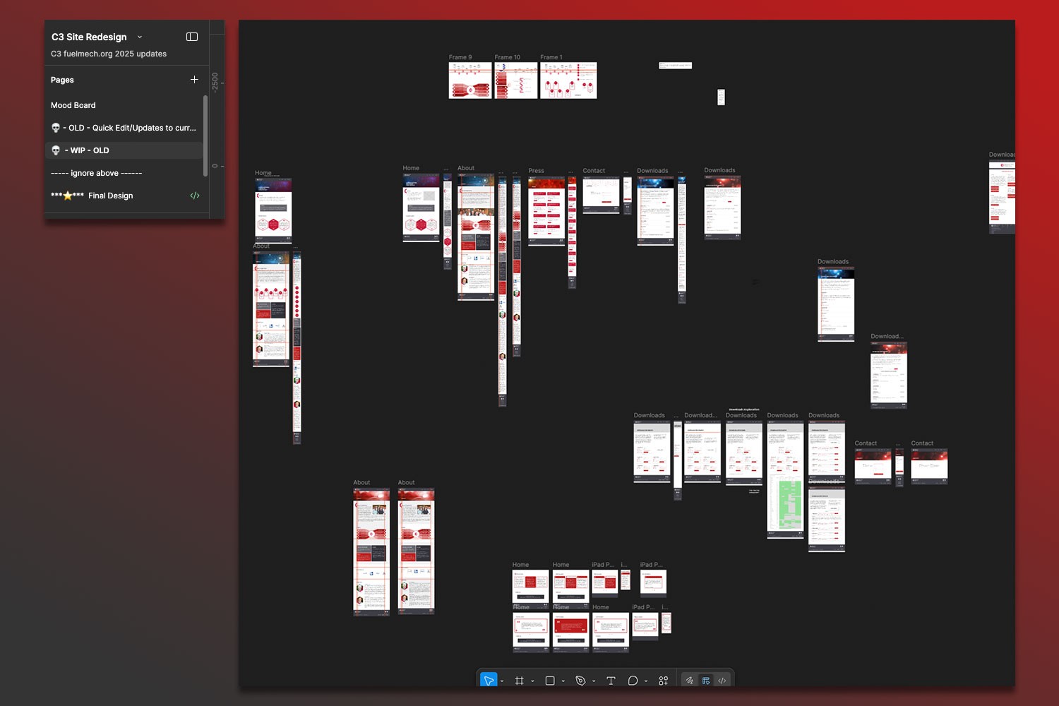
The next image shows my figma file layers. I started each project with inspiration and moodboarding. For this specific project, I didn't need to wireframe with gray boxes, the information was all there and with such a small site I just needed to organize it better.
Planning
My first page was exploring how to lay things out, how to design the timeline component, the downloads page and playing around. Once the timeline graphic and components were solidified with the team and what made sense on the development side, then I created my final working file and created the full pages plus mobile views.